Matplotlib Module - Python
What is matplotlib?
"matplotlib" is a highly important module in python that is used to visualize data. It is a powerful tool that can graph datasets in various shapes like histograms, pie charts, linear graphs, and much more. This module is considered to be essential for learning data visualization, data analysis, AI specialization, and data science.
Installing and Importing
Run this command on the CMD to install the module:
pip install matplotlib
Import the required modules:
import matplotlib.pyplot as plt


# these two need to be installed
import numpy as np
import seaborn as sns
Basic plotting methods
The (plot) method
Passing one argument
If we pass only one array as an argument, it will use it as Y-axis and represent the X-axis as an incremented list [0, 1, 2, 3, 4, …] to fill Y-points.
NOTE: plots won’t be displayed until we use the command plt.show() that will display the latest figure that had been plotted
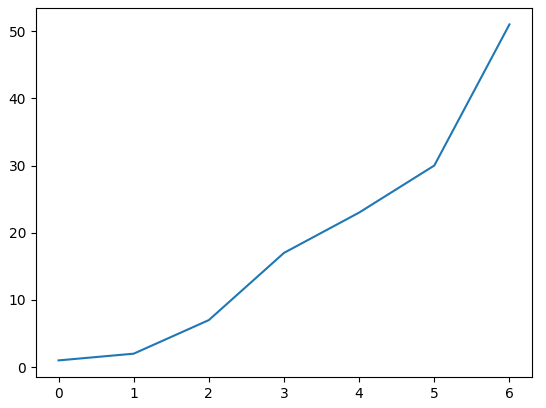
y = [1, 2, 7, 17, 23, 30, 51]
plt.plot(y)


plt.show()
Passing two arguments
If we pass two arguments, they will be representing the Y-axis and the X-axis. The length of both x and y must be the same.
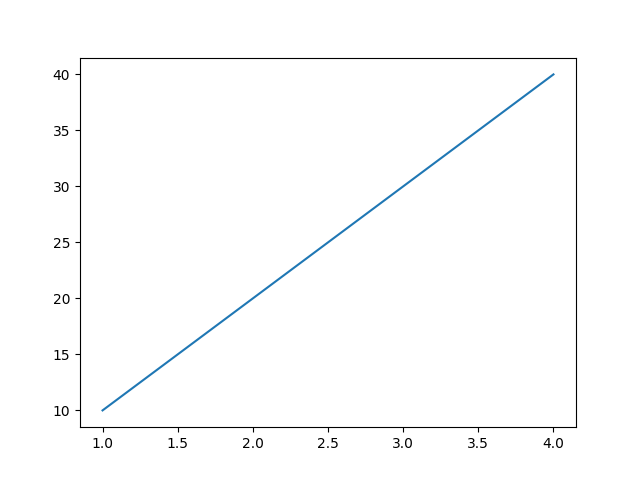
x, y = [1,2,3,4], [10,20,30,40]
plt.plot(x, y)
An equation as an axis
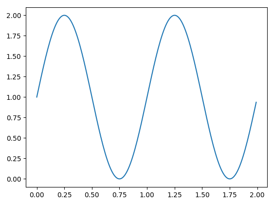
t = np.arange(0, 2, 0.01)
s = 1 + np.sin(2 * np.pi * t)
plt.plot(t, s)
The (bar) method
we can create a bar plot for categorical and numeric data.
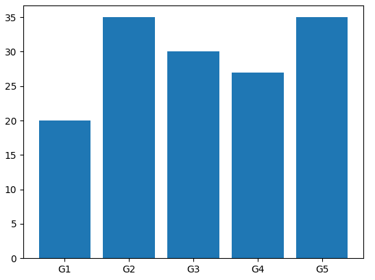
Single category
labels = ['G1', 'G2', 'G3', 'G4', 'G5']
y = [20, 35, 30, 27, 35]


# labels will be on the x-axis and the numbers on the y-axis
plt.bar(labels, y)
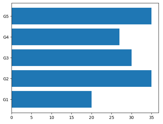
Single category (Horizontal)
# orient the bar to be horizontal
labels = ['G1', 'G2', 'G3', 'G4', 'G5']
y = [20, 35, 30, 27, 35]
plt.barh(labels, y)
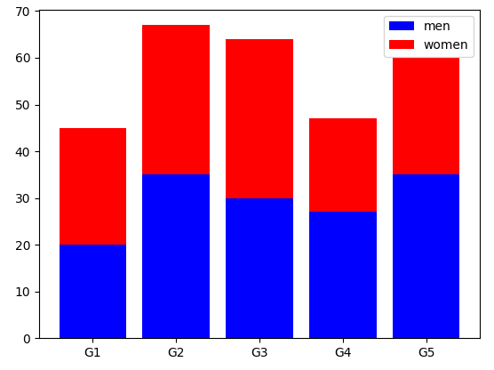
Multiple categories
labels = ['G1', 'G2', 'G3', 'G4', 'G5']
y1 = [20, 35, 30, 27, 35]
y2 = [25, 32, 34, 20, 25]


plt.bar(labels, y1, color='b', label='men')
plt.bar(labels, y2, color='r', label='women', bottom=y1)  # specify which one is at the bottom


plt.legend(
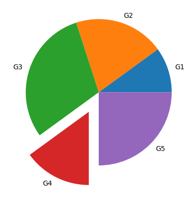
The (pie) method
it creates a pie chart that takes only numeric values and divides the pie according to the percentage of each one to the total sum of all of them.
NOTE: the total sum of numbers doesn’t necessarily equal 100, it can be any number and the pie will be distributed as percentages NOT values
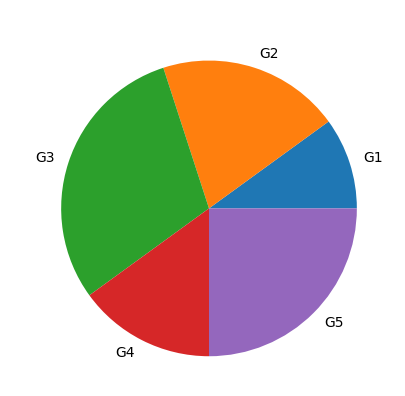
Complete pie
values = np.array([10,20,30,15,25])
Labels = ["G1", "G2", "G3", "G4", "G5"]


plt.pie(values, labels=Labels)
Cut a piece of the pie
if we want to highlight one or more pieces of the pie, we pass a numeric list to the argument (explode). Zeros refer to non-highlighted pieces, and positive numbers refer to the distance away from the center of the pie for the highlighted pieces
values = np.array([10,20,30,15,25])
Labels = ["G1", "G2", "G3", "G4", "G5"]
highlighted = [0, 0, 0, 0.3, 0]


plt.pie(values, labels = Labels, explode= highlighted)
The (hist) method
It creates a histogram using a column of data
iris = sns.load_dataset("iris")  # get pre-defined data from seaborn
plt.hist(iris.sepal_length, bins=20)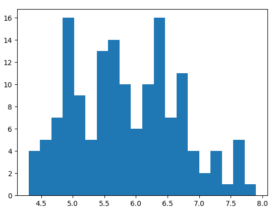
Configuring plots
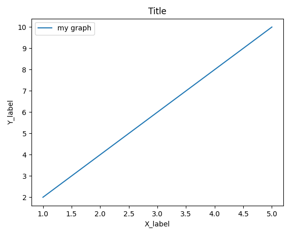
Adding labels
We can add some labels (legends) to mark the graph and define its characteristics.
x, y = [1,2,3,4,5], [2,4,6,8,10]


plt.plot(x, y, label='my graph')  # add a label at the graph
plt.xlabel('X_label')  # add a label on the x-axis
plt.ylabel('Y_label')  # add a label on the y-axis
plt.title('Title')  # add a title to the figure


plt.legend(NOTE: we have to use the command plt.legend() to show the marks
Scaling the plot
# adjust the size of the plot to be 8x4 units
plt.rcParams['figure.figsize'] = 8, 4
Change the limits of the plot
iris = sns.load_dataset("iris")
sns.kdeplot(iris.sepal_length, iris.sepal_width, xlim=(0, 8), ylim=(0, 8))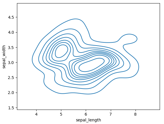
Modify the line plot
plt.plot(x, y, c="Black")  # change the color to be black
plt.plot(x, y, ls="--")  # change the line shape to be dashes
plt.plot(x, y, marker="s")  # change the dots' shape to be squares
plt.plot(x, y, ms=8)  # change the marker (dots) size to be 8
plt.plot(x, y, rotation="vertical")  # rotate the graph to be vertical
Example:
iris = sns.load_dataset("iris")
plt.plot(iris.sepal_length, c="Red", ls="--", marker="d", ms=3)
plt.plot()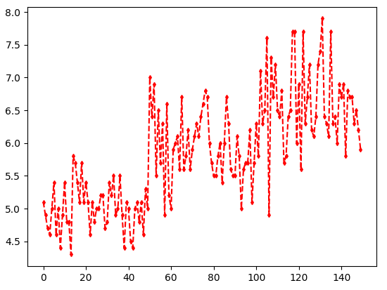
Markers
( . ) for point marker
( o ) for circle marker
( v, ^, <, > ) for triangle markers in all directions
( s ) for square marker
( * ) for star marker
( + ) for plus marker
( x ) for X marker
( D ) for dimond marker
Colors
( b ) for blue
( g ) for green
( r ) for red
( c ) for cyan
( y ) for yellow
( k ) for black
( w ) for white
Line styles
( - ) for sokid line style
( -- ) for dashed line style
( -. ) for dash-dot line style
( : ) for dotted line style
Subplots methods
We can plot more than one graph at the same figure using some methods in matplotlib.
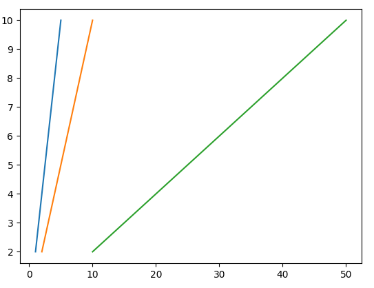
Plot stacked graphs
We can plot multiple graphs on the top of each other by using the (plot) method many times then use the (show) method once
x1, x2, x3 = [1,2,3,4,5], [2,4,6,8,10], [10, 20, 30, 40, 50]
y1 = [2,4,6,8,10]


plt.plot(x1,y1)
plt.plot(x2,y1)
plt.plot(x3,y1)


plt.show(
The (subplot) method
We can add multiple plots to the same figure distributed as a grid of rows and columns. We use this one when we don't know how many cells we need because it defines the place for the graph just before it has been created.
plt.subplot(3, 2, 5) # subplot(row, col, index)
the previous command will append the next plot to the figure at the 3rd row and 2nd column and place it on the index 5. We have to set the subplot before plotting, then we add labels and colors and finally show the whole plot.
x, y = [1,2,3,4], [10,20,30,40]
plt.subplot(1, 2, 1)
plt.plot(x,y)
plt.title("Line plot 1")  # add a title for the subplot 1


x2, y2 = [1,2,3,4], [10,20,30,40]
plt.subplot(1, 2, 2)
plt.plot(x2,y2)
plt.title("Line plot 2")  # add a title for the subplot 2


plt.suptitle("Multiple plots")  # add a title for the whole plot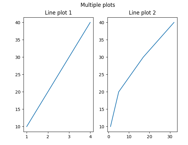
The (subplots) method
This method defines the whole grid of plots before we start plotting. Then we can place any graph we plot at the desired cell.
Creating a figure
If we created a figure with 1 row, we add plots to it using one inex (which is the index of the column).
# create a grid of 1 row and 3 columns
fig, axes = plt.subplots(1, 3)
If we created a figure with multiple rows and columns, we add plots to it using two indexes (which are for row and column).
# create a grid of 2 rows and 3 columns
fig, axes = plt.subplots(2, 3)
Assigning graphs to the figure
We assign the plot to a specific index. There is a slight difference between assigning sns (seaborn) plots or plt (matplotlib) plots.
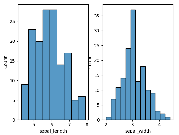
# prepare data from seaborn
iris = sns.load_dataset("iris")
If we have one row:
# create the figure
f, axes = plt.subplots(1, 2)


# add the plots at indexes 0 and 1
sns.histplot(iris.sepal_length, ax=axes[0])
sns.histplot(iris.sepal_width, ax=axes[1])
plt.show()
If we have more than one row:
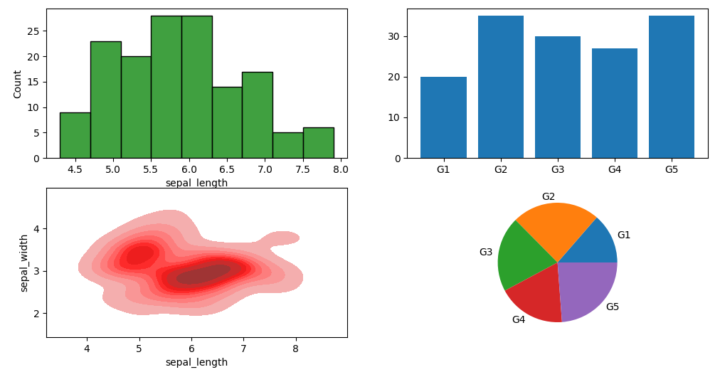
# create the figure
f, axes = plt.subplots(2, 2, figsize=(12, 6))  # figsize: it resises the figure


# add the plots for each index
# For sns plots:
sns.histplot(iris.sepal_length, ax=axes[0, 0], color="Green")
sns.kdeplot(iris.sepal_length, iris.sepal_width, ax=axes[1, 0], color="Red", shade=True)
# For plt plots
axes[0, 1].bar(['G1','G2','G3','G4','G5'], [20,35,30,27,35])
axes[1, 1].pie([20,35,30,27,35], labels=['G1','G2','G3','G4','G5'])


plt.show(
Change the size of the figure
# change the size of the figure by a ratio (width, height)
fig, axes = plt.subplots(2, 3, figsize=(12, 6))
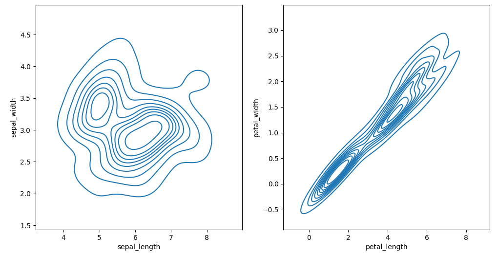
Share values of the axis (X and Y)
Assign the same values of X-axis and/or Y-axis between figures
f, axes = plt.subplots(1, 2, sharex=True, sharey=True)
sns.kdeplot(iris.sepal_length, iris.sepal_width, ax=axes[0])
sns.kdeplot(iris.petal_length, iris.petal_width, ax=axes[1])


Comments
Post a Comment